
New Alphabet: An Introduction for a Programmed Typography
| Home > Browse Our Collection > Promotional Material > Miscellaneous > New Alphabet: An Intr ... Programmed Typography |
|
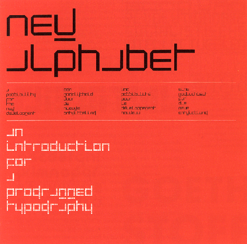
In 1963, Wim Crouwel (pronounced Vim) was one of the founders of the design studio Total Design (currently named Total Identity). From 1964 onwards, Crouwel was responsible for the design of the posters, catalogues and exhibitions of the Stedelijk Museum in Amsterdam. In 1967 he designed the typeface New Alphabet, a design that embraces the limitations of the cathode ray tube technology used by early data display screens and phototypesetting equipment and thus only contains horizontal and vertical strokes. Other typefaces from his hand are Fodor and Gridnik. In 1970 he designed the Dutch pavilion for Expo '70 (Osaka, Japan). A design of Crouwel that is well known in the Netherlands is that of the Number Postage Stamps for the Dutch PTT (in circulation from 1976–2002). According to Wim Crouwel, New Alphabet was ‘over-the-top and never meant to be really used’. However, as unreadable as it was, it made a comeback in 1988 when designer Brett Wickens used a version of the font on the sleeve of Substance by Joy Division. We are extremely grateful to both Dawn and Kim Wakefield for the kind donation of the collection of their late father Richard Wakefield. Date : 1967Creator : Wim Crouwe Physical Description : Booklet, A counter-proposal booklet This exhibit has a reference ID of CH15845. Please quote this reference ID in any communication with the Centre for Computing History. |
 Click on the Image For Detail
|